Jupyter Notebooks with Tidy-TS
Interactive data analysis and visualization with Tidy-TS in Jupyter notebooks.
Setup: Deno with Jupyter
Tidy-TS works with Deno's built-in Jupyter kernel
As long as you have Deno installed, your VSCode or Cursor editor should automatically detect and use the Deno kernel for .ipynb files. No configuration files needed!
// 1. Install Deno (if not already installed)
// Visit: https://docs.deno.com/runtime/getting_started/installation/

// 2. Install required VSCode extensions:
// - denoland.vscode-deno (for TypeScript support)
// - ms-toolsai.jupyter (for notebook support)

// 3. Create a .ipynb file and select the Deno kernel
// The kernel selector appears in the top-right corner
// 1. Install Deno (if not already installed)
// Visit: https://docs.deno.com/runtime/getting_started/installation/
// 2. Install required VSCode extensions:
// - denoland.vscode-deno (for TypeScript support)
// - ms-toolsai.jupyter (for notebook support)
// 3. Create a .ipynb file and select the Deno kernel
// The kernel selector appears in the top-right cornerRequired Extensions
Deno Extension
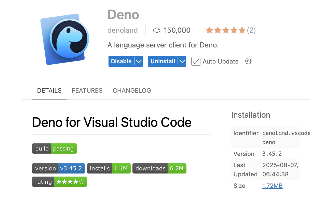
Install the denoland.vscode-deno extension for TypeScript support and Deno integration.
Jupyter Extension
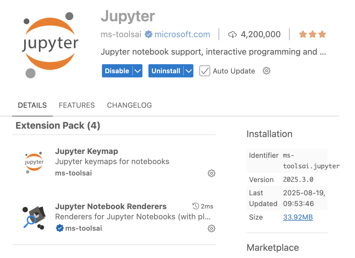
Install the ms-toolsai.jupyter extension for notebook support and interactive cells.
Once both extensions are installed, create a .ipynb file and select the Deno kernel.
Data Visualization
Create interactive charts and visualizations
Jupyter notebooks are great for exploring data and visualizing it.
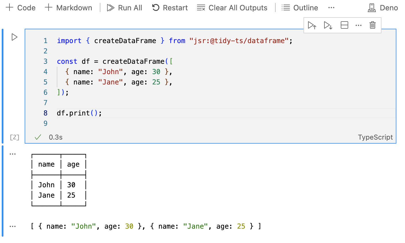
import { createDataFrame } from "jsr:@tidy-ts/dataframe";

// Sample sales data
const salesData = createDataFrame([
  { month: "Jan", sales: 1000, profit: 200 },
  { month: "Feb", sales: 1200, profit: 300 },
  { month: "Mar", sales: 1100, profit: 250 },
  { month: "Apr", sales: 1300, profit: 400 },
  { month: "May", sales: 1400, profit: 500 }
]);

// Calculate profit margin
const withMargin = salesData
  .mutate({
    profitMargin: row => (row.profit / row.sales * 100).toFixed(1) + "%"
  });

console.log("Sales data with profit margin:", withMargin);

// Group by month and calculate totals
const monthlyTotals = salesData
  .groupBy("month")
  .summarize({
    totalSales: "sales",
    totalProfit: "profit"
  });

console.log("Monthly totals:", monthlyTotals);
import { createDataFrame } from "jsr:@tidy-ts/dataframe";
// Sample sales data
const salesData = createDataFrame([
{ month: "Jan", sales: 1000, profit: 200 },
{ month: "Feb", sales: 1200, profit: 300 },
{ month: "Mar", sales: 1100, profit: 250 },
{ month: "Apr", sales: 1300, profit: 400 },
{ month: "May", sales: 1400, profit: 500 }
]);
// Calculate profit margin
const withMargin = salesData
.mutate({
profitMargin: row => (row.profit / row.sales * 100).toFixed(1) + "%"
});
console.log("Sales data with profit margin:", withMargin);
// Group by month and calculate totals
const monthlyTotals = salesData
.groupBy("month")
.summarize({
totalSales: "sales",
totalProfit: "profit"
});
console.log("Monthly totals:", monthlyTotals);Interactive Charts
Create interactive visualizations with hover tooltips
In Jupyter notebooks, charts automatically display with interactivity when you reference the chart object.
import { createDataFrame } from "jsr:@tidy-ts/dataframe";

// Create sample sales data
const salesData = createDataFrame([
  { region: "North", product: "Widget", quantity: 10, price: 100 },
  { region: "South", product: "Widget", quantity: 20, price: 100 },
  { region: "East", product: "Widget", quantity: 8, price: 100 },
  { region: "North", product: "Gadget", quantity: 15, price: 200 },
  { region: "South", product: "Gadget", quantity: 12, price: 200 },
]);

// Interactive scatter plot with configuration
const interactiveChart = salesData
  .mutate({
    revenue: (r) => r.quantity * r.price,
    profit: (r) => r.quantity * r.price * 0.2,
  })
  .graph({
    type: "scatter",
    mappings: {
      x: "revenue",
      y: "quantity",
      color: "region",
    },
    config: {
      layout: {
        tooltip: {
          show: true, // default true
        },
      },
      tooltip: {
        fields: ["region", "revenue", "quantity", "profit", "product"],
      },
    },
  });

interactiveChart // Chart displays interactively in Jupyter cell
import { createDataFrame } from "jsr:@tidy-ts/dataframe";
// Create sample sales data
const salesData = createDataFrame([
{ region: "North", product: "Widget", quantity: 10, price: 100 },
{ region: "South", product: "Widget", quantity: 20, price: 100 },
{ region: "East", product: "Widget", quantity: 8, price: 100 },
{ region: "North", product: "Gadget", quantity: 15, price: 200 },
{ region: "South", product: "Gadget", quantity: 12, price: 200 },
]);
// Interactive scatter plot with configuration
const interactiveChart = salesData
.mutate({
revenue: (r) => r.quantity * r.price,
profit: (r) => r.quantity * r.price * 0.2,
})
.graph({
type: "scatter",
mappings: {
x: "revenue",
y: "quantity",
color: "region",
},
config: {
layout: {
tooltip: {
show: true, // default true
},
},
tooltip: {
fields: ["region", "revenue", "quantity", "profit", "product"],
},
},
});
interactiveChart // Chart displays interactively in Jupyter cell